ThousandEyes’ Multi-Product UX Journey
From 2016 H2 – 2019 H1, I achieved and sustained ⭐️4.73 / 5 Gartner Customer Experience Rating (across 48 company reviews) primarily as a first and solo product designer. I built design foundations and experience strategy that aligned with product expansiong and finally resulted in Cisco’s $1B acquisition
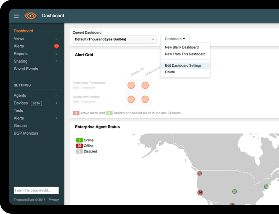
A complete revamp for a leading performance monitoring platform
Starting from a solo designer to the leader of the product design team, I led the design efforts to drive the final success of this great product
THE DESIGN CHALLENGE
Various Products, Various Scenarios for a platform that is scaling
ThousandEyes is a network intelligence platform acting as the "Google Maps for the Internet"—visualizing exactly where data is delayed, dropped, or throttled across global, invisible networks.

When I joined as the sole designer, ThousandEyes relied on a single flagship offering:
Cloud & Enterprise Agents: Active probes simulating network traffic from data centers to critical servers.
During my tenure, the company experienced a strategic product explosion, scaling rapidly into a complex, multi-product suite. Each new product introduced its own distinct target audience, deployment constraints, data visualization strategies, and commercial models:
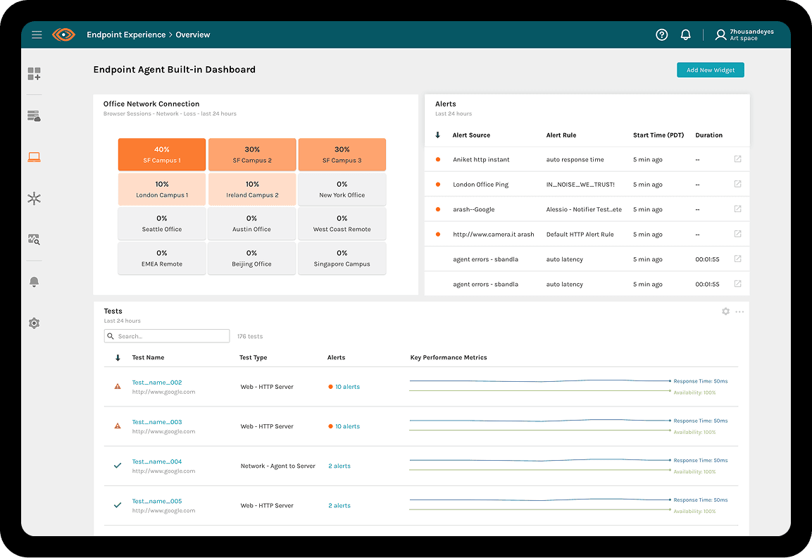
Endpoint Agents (New): Agents installed on employee laptops to monitor network quality for remote and branch offices.
Device Layer (New): Automated discovery and visualization of physical local-network infrastructure (switches, routers).
Internet Insights (New): Aggregating telemetry from global agents to visualize macro internet outages in real-time.
The Core UX Paradox: Cohesive Diversity vs. Seamless Consistency
As the design lead, my ultimate challenge was a double-edged sword:
How could we honor the unique, deep technical needs of each specialized user persona while maintaining a cohesive, intuitive platform experience?
To solve this, I designed and established a unified Platform UX Architecture that bridged these products seamlessly.
Key Design Pillars & The UX Framework
We resolved the friction between product-specific needs and platform consistency through three strategic design pillars:
Multi-Product Data Visualization: Designing for Progressive Disclosure
Unified “Day 0” Onboarding: Reducing Time-to-Value
Unified Billing & Quoting: Designing for Commercial Transparency
The Problem
While Cloud Agents visualized linear path routing, the new Endpoint Agents monitored tens of thousands of individual laptops, generating millions of fragmented data points. Directly plotting these on-screen created an unreadable, overwhelming "spaghetti monster" of data.
Original beta version doesn’t work well for large-scale data
The Framework Solution
I established a 3-step interactive telemetry framework based on Progressive Disclosure to manage extreme cognitive overload:
Summary Overview: The first fold presents high-level system health overview and chronological trends.
Concentrated Alerts: Highlight and cluster detected network anomalies. At this critical stage, we deliberately hide deep technical data details, shielding the user from unnecessary noise.
Diagnostic Node Grouping: Only when the user decides to deep-dive into a specific alert does the UI reveal the interactive Node Grouping visualization. Here, chaotic data streams are dynamically clustered into clean, logical node groups. Users can then perform fluid Zoom-in / Zoom-out and drag interactions to peel back layers of technical data and pinpoint the exact failing router or terminal.
This "Alert-Focused, On-Demand Diagnostic" model was so successful that we later adapted it to visualize the physical topologies of the Device Layer and the macro outage maps of Internet Insights.
Designing for Progressive Disclosure
Multi-Product Data Visualization
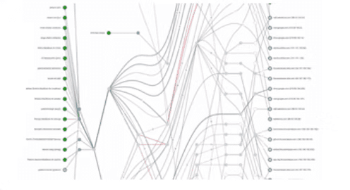
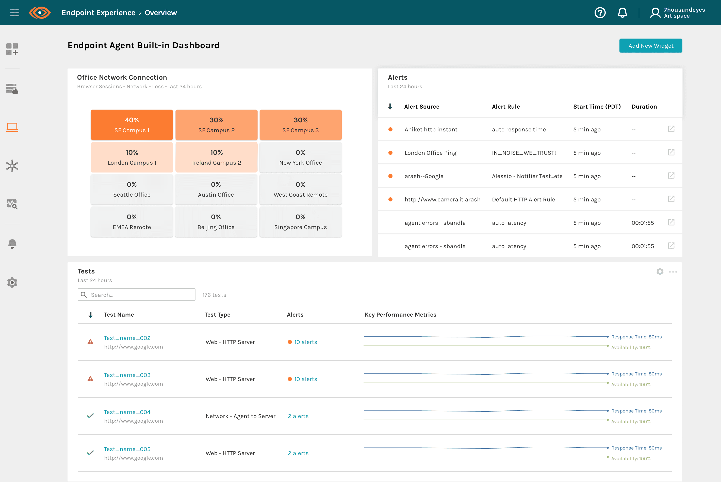
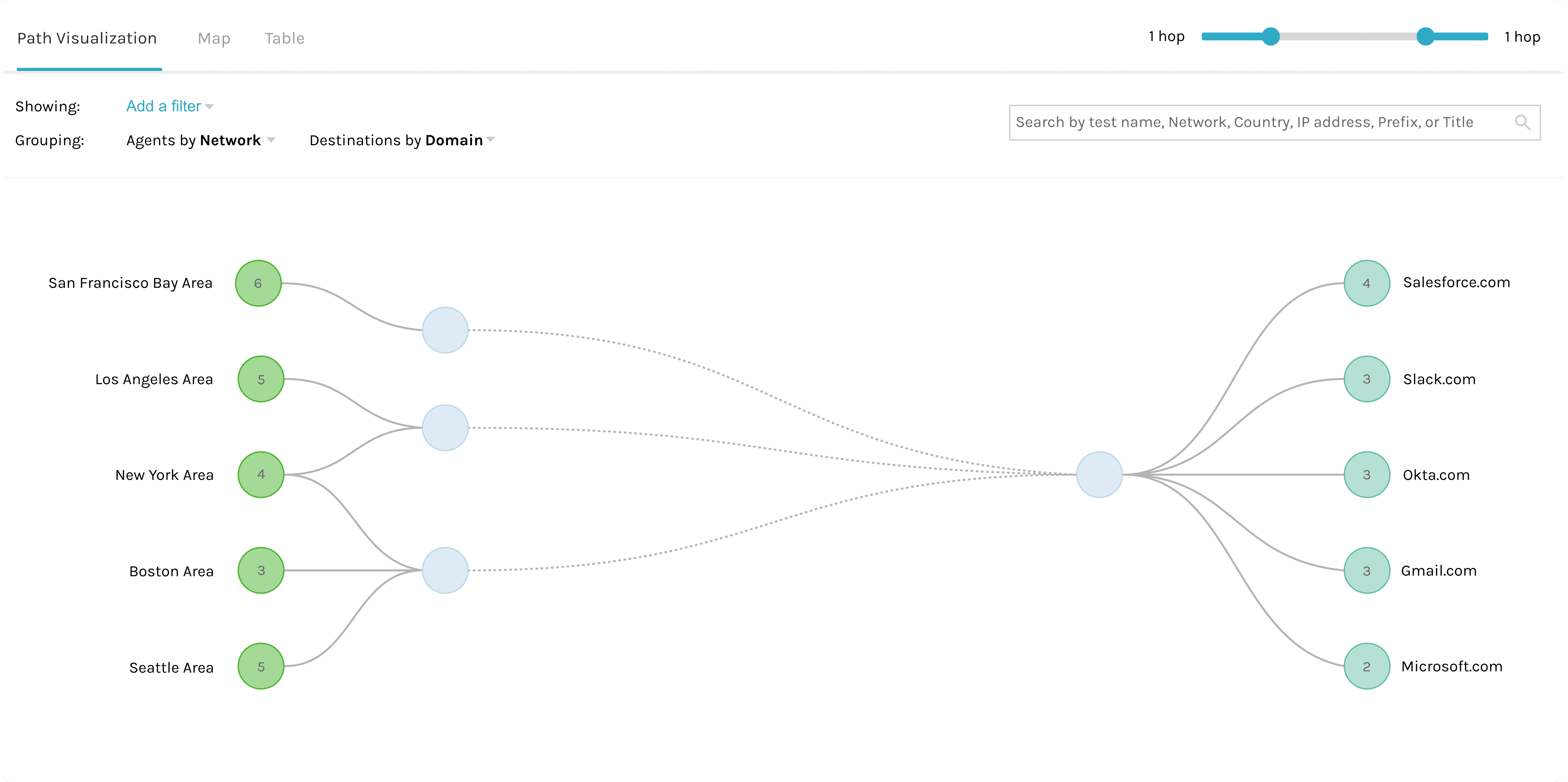
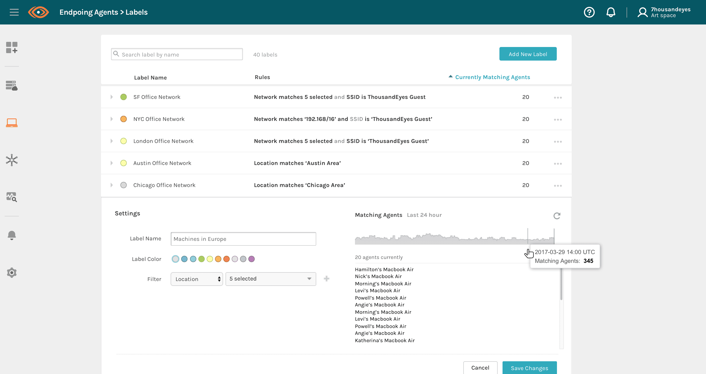
Illustration to guide actions
Same framework was applied to another product
Reducing Time-to-Value
Unified “Day 0” Onboarding
The Problem
Deployment strategies across the products varied wildly. Cloud Agents required zero install; Endpoint Agents required IT admins to push silent, mass installations via MDM (Mobile Device Management) to thousands of employee laptops; and Device Layer required complex LAN scanning setup. Facing cold, technical configuration pages on Day 0 led to massive trial drop-offs.
Goal
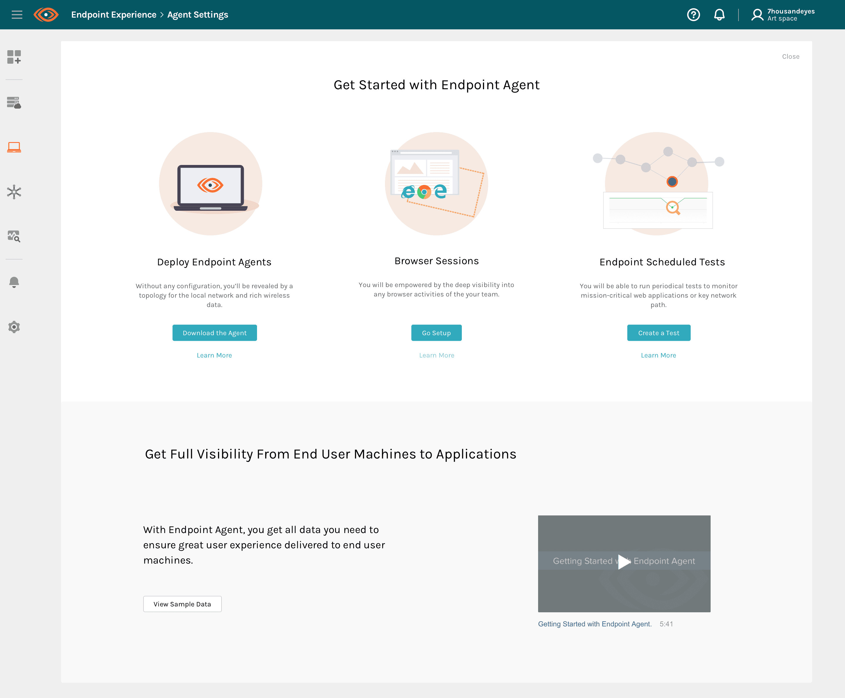
I designed a "Value-First, Guided Setup" onboarding blueprint:
Illustrations & Sample Data: Upon entering any new product line, users are greeted with high-fidelity, scenario-specific illustrations and interactive sample data tailored to their specific roles (e.g., Network Engineer vs. Help Desk). This allows users to immediately grasp the value of the tool and see what their finalized dashboard will look like before writing a single line of config.
Deployment Wizard: Once value is established, a highly unified step-by-step wizard guides users through the technical setup. No matter how dense the underlying tech (command-line inputs or bulk software distribution), the UI wraps it in consistent progress indicators, real-time feedback, and clear error-validation.
Unified Billing & Quoting
Designing for Transparency
The Problem
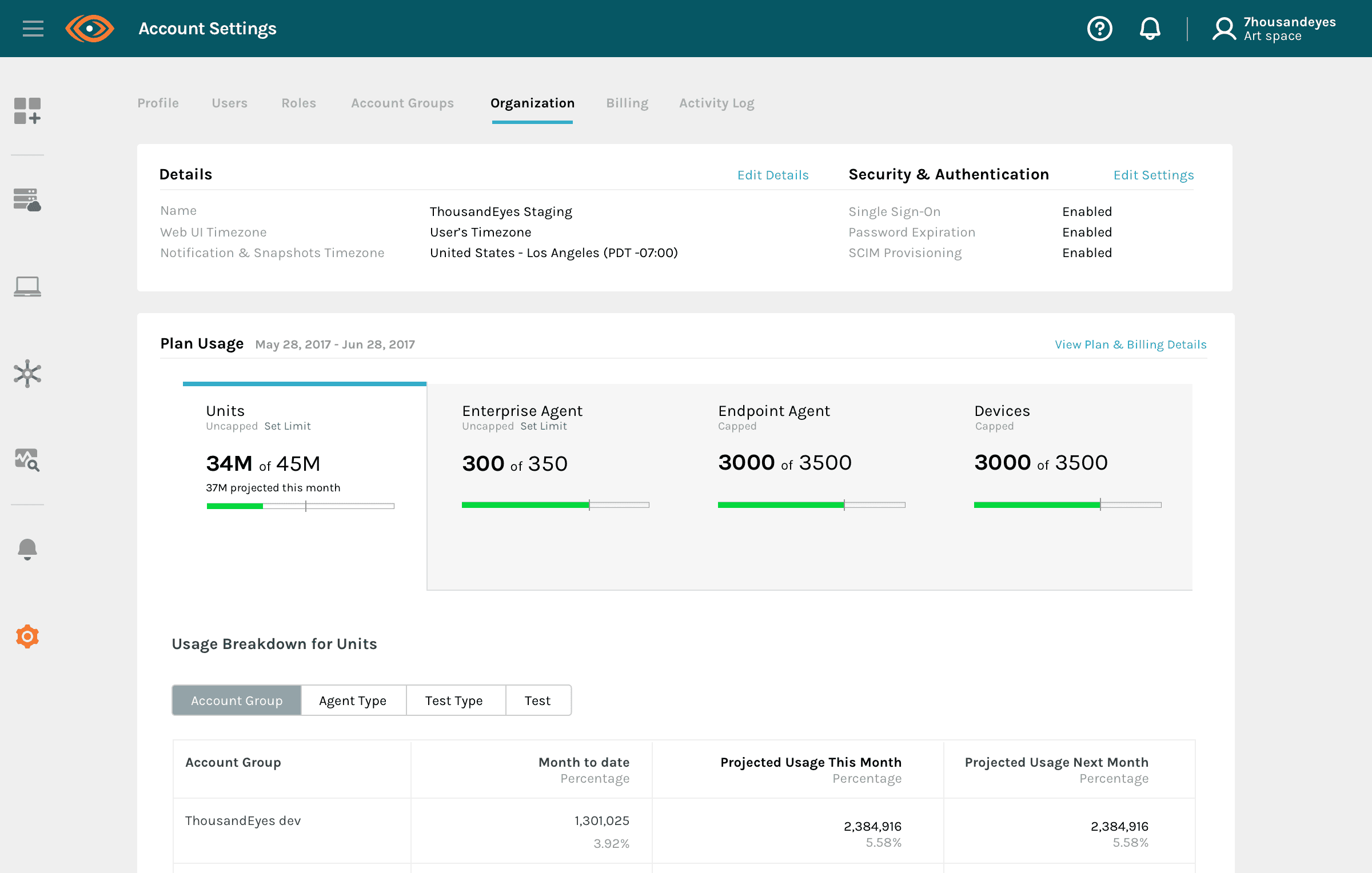
Transitioning from one to four products introduced complex, mismatched pricing structures (e.g., usage-based billing vs. license-based subscriptions). Enterprise buyers struggled to understand the total cost of ownership of the platform.
Goal
I redesigned the platform's Organizational Overview and created a dynamic Quoting Tool. This design translated complex tier calculations into an interactive interface, enabling enterprise buyers to easily assign quotas, predict costs, and manage budgets across all product lines from a single pane of glass.

The Results

Gartner Experience Review
4.73/5
Complete product evolution while maintaining great UX during my tenure
Company valuation
Company valuation grew rapidly and resulted in a great exit (acquired by Cisco).
20x growth
UI Design
Product Design
Design Function Transforms over time